
Of course we could edit out the background cars and even the tent overhead. That would help some, but we'd still have a bunch of objects to deal with. One of the best ways to stay out of the trap is to find a pattern of darks and lights and sketch all those into a flat four-value pattern where like values connect. If we break the photo down into a four-value pattern, we get this:

or you might increase the feeling of shadow by doing this:

or you might increase the feeling of light by doing this:


or you might increase the feeling of shadow by doing this:

or you might increase the feeling of light by doing this:

So what has happened is that all the shadows have been reduced to two values of connecting darks and all the areas in direct light are reduced to two connecting light values. In the two dark values, there is one dark and one mid-dark; in the two lights, one where the light his totally white and one where it's light-mid. If, when painting, we think of color as color value rather than as hue, we'll weld those images together and avoid the image trap.
Each color we see possesses a hue (the color name), an intensity (the color's brilliance or lack of neutrality), a value (dark to light), and a temperature (warm or cool). When we are concentrated only on the color name (red, yellow, and all that), we fall into the image trap, but when we think of the color as to what value it is, we're most likely to avoid the trap.
Richard Schmid illustrates this principle beautifully in his painting "Orange Pansies".
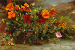
"Orange Pansies"
Oil on Canvas
Richard Schmid
Notice how the pansies in direct light are a lighter, brighter orange whereas those in shadow are a darker orange. Notice how where the foliage is mostly in shadow, the values of greens are kept in dark range whereas the greens in direct light are a lighter value. Notice also that the foliage in shadow is a cooler green whereas in light, the green is warmer, more intense.

In this posterized version, I've dropped "Orange Pansies" to four values. You can see how Schmid keeps a strong connected dark pattern with just a single accent of strong light. Yummy. His mid-darks are dominate, carry the day, with the darkest darks just playing the role of accenting. Then the mid-lights connect together as a supporting pattern with that one lightest-light and a few scattered spots of it as accent. The mid-dark oranges take on the same value range as their surrounding greens. Notice that.


No image trap here. But then, he IS the master, isn't he.
3 comments:
Hi Dianne, I'm so glad you found me thru Qiang's blog! Now I've found you :) and your wonderful art work and writing. What a wealth of knowledge you have here for us.
Best Wishes,
Dawn McKelvy
Thanks, Dawn and welcome aboard. I'm having fun doing this. So glad you enjoy it.
Post a Comment